 |
|
|
|
|
|
|
|
|
|
|
| |
|
|
|
|
 |
|
| |
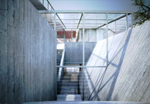
This project is a new type of museum used for teaching with four distinct collections of artefacts, musical instuments, and prints, located in the center of the Wesleyan University Campus. To preserve the open quality and natural setting of the existing campus court, the building design preserves all trees on the site and buries itself underground. Designed to allow varied use and re-use over time the building consists of three parts: a concrete shell supporting a glass envelope containing configurable exhibition units. Separate structures inside create spaces that cater to the specific requirements of the collections, lecture halls, and reading rooms. The large open gallery allows fast switching of exhibits and its light can be controlled through hanging curtains that can continuously move thoughout the day, making it a light and visually exciting space.
|
| |
|
| |
This building approaches sustainable design of institutional buildings in an integrated way. In the design process, primary care has been given to its technical, economic and functional longevity. For a building to be truly sustainable, it must be designed with longevity in mind, ensuring that it can can support a variety of functions over time. In this way, new construction is avoided. This new typology permeates every part of the building: the way space is used with double functions (hallways doubling as ventilation shafts and access routes), the use of materials, the configurability of the spaces, and the method of its construction. Its foundation uses a labyrinth for earth-cooling, a long forgotten building system used by the Egyptians, not only to insure low-energy climate control but also to provide a foundational grid that supports the changing of the building's functions over time.
Campus buildings often change their function over time. Physics buildings become dorms, service buildings become classrooms. For this project, our brief was quite specific, and we had reservations about the long term viability of the fragmented museum program. However, rather than responding to this problem by designing a generic loft space (the typical approach for flexible programming), this design uses a strategy that provides a gradient of permanence in three steps: a concrete shell, glass envelope, and
|
| |
|
|
|
| |
| |
|
| |
light-weight interior partitioning. The base of the building is a solid concrete vessel that is sunken below grade. This permanent structure integrates circulation and provides a large surface for future development. Within this structure, a building is designed that has various degrees of reconstructability, but is mainly light and uses hooks and concrete support nodes for its foundation, structural support, circulation, and ventilation system. The building’s main envelopes are offset from the concrete structure to allow for air flow. The cavity which is created is therefore both ductile and a tactile, but avoids creating a visual separation between the permanent and temporary elements.
To further diversify the architecture of Wesleyan campus, a novel method of establishing the relationship between the building and ground surface was selected; different from those already present on campus. To balance the scale of the adjacent buildings and large trees on the site, we chose a strategy of vertical recession. This also alleviates the courtyard park behind the building from a large structure that would interfere with its openness. The building is therefore largely constructed below grade and allows for users to populate various parts of the roof.
The third principle of the building is its organization. The building is divided in two parts, a private administrative section and "back of house" section, mostly opaque, and an open gallery section. They are separated and rotated to provide the maximum envelope while still maintaining the trees and their root systems. The front section addresses
|
| |
|
|
|
| |
|
| |
the road and the adjacent Davidson Art Center, while the larger rear volume addresses the campus courtyard. The volumes themselves are split up into three levels; a private level sandwiched between two public levels, which have various sectional relationships. Private and public areas are alternately expressed in circulation by the use of opaque tunnels or transparent walkways. The programme is expressed in the main volume, the gallery, as well as in the gallery's integrated open study areas, where volumes for the various other departments are literally suspended. An open visual organization is thus achieved, offering both recognizability due to coding of volumes with material type, as well as an engaging visual complexity. The main gallery spaces are thus left completely unprogrammed, allowing for total configurability.
The climate and lighting strategies are closely interwoven, using control devices that allow for any desired lighting and climate condition. An outdoor sun shading system prevents internal heat gain while an internal shading system allows for diffused light to enter. During winter, solar heat gain can be increased to reduce heating energy consumption without impacting the desired amount of lighting. The indoor system takes the form of a battery of vertical adjustable banners, each of which has a certain degree of transmittance. Due to their number and placement, the space can be configured for various lighting levels and climate control.
For more information on this project, please contact us. |
| |
|
|
|
|
|
 |
|
|
| |
|
|
|
|
 |
|
|
|
|
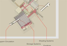 |
| Programmatic Diagrams |
|
|
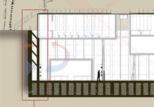 |
| Sections |
|
|
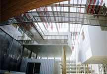 |
| Interior Images |
|
| |
|
|
|
|
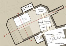 |
| Plans |
|
|
|
|
 |
| Exterior Images |
|
|
|
|
|
| all contents © 2008 except |
 |
|
|
|